Simon's use case
Simon Flood at Securelinx suggested a use case as follows; A visual representation of the valid upgrade paths available for Harvester.
Mermaid
graph LR;
    1.0.0-->1.0.1;
    1.0.1-->1.0.2;
    1.0.2-->1.0.3;
    1.0.3-->1.1.0;
    1.0.3-->1.1.1;
    1.1.0-->1.1.1;
    1.1.0-->1.1.2;
    1.1.1-->1.1.2;
    1.1.2-->1.2.0;
    1.1.2-->1.2.1;
    1.2.0-->1.2.1;
The first iteration
Swapping the 1.1.0 lines to avoid path overlapping.
Top to bottom orientation
It would be nice to swap to this if on a phone screen. Option via tabs perhaps. But only for the diagram switch. I'm not a fan of tabs if they hide searchable content.
- Horizontal LR
- Vertical TB
Some twiddling of options
Playing with shapes, etc. It needs the neutral theme to avoid the link text line running through the link text.
- Horizontal LR
- Vertical TB
Final Mermaid version
A final version for this application:
- Horizontal
- Vertical
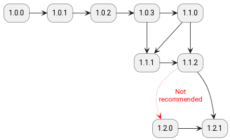
PlantUML
@startuml
    skinparam roundcorner 25
    rectangle "1.0.0" as rel.1.0.0
    rectangle "1.0.1" as rel.1.0.1
    rectangle "1.0.2" as rel.1.0.2
    rectangle "1.0.3" as rel.1.0.3
    rectangle "1.1.0" as rel.1.1.0
    rectangle "1.1.1" as rel.1.1.1
    rectangle "1.1.2" as rel.1.1.2
    rectangle "1.2.0" as rel.1.2.0
    rectangle "1.2.1" as rel.1.2.1
    rel.1.0.0 -> rel.1.0.1
    rel.1.0.1 -> rel.1.0.2
    rel.1.0.2 -> rel.1.0.3
    rel.1.0.3 -> rel.1.1.0
    rel.1.0.3 --> rel.1.1.1
    rel.1.1.0 --> rel.1.1.1
    rel.1.1.0 -> rel.1.1.2
    rel.1.1.1 -> rel.1.1.2
    rel.1.1.2 --> rel.1.2.0 #line.dotted;line:red;text:red : Not\nrecommended
    rel.1.2.0 -> rel.1.2.1
    rel.1.1.2 -> rel.1.2.1
@enduml
produces PNG:

or SVG (which seems to render better):
Diagrams/Mingrammer
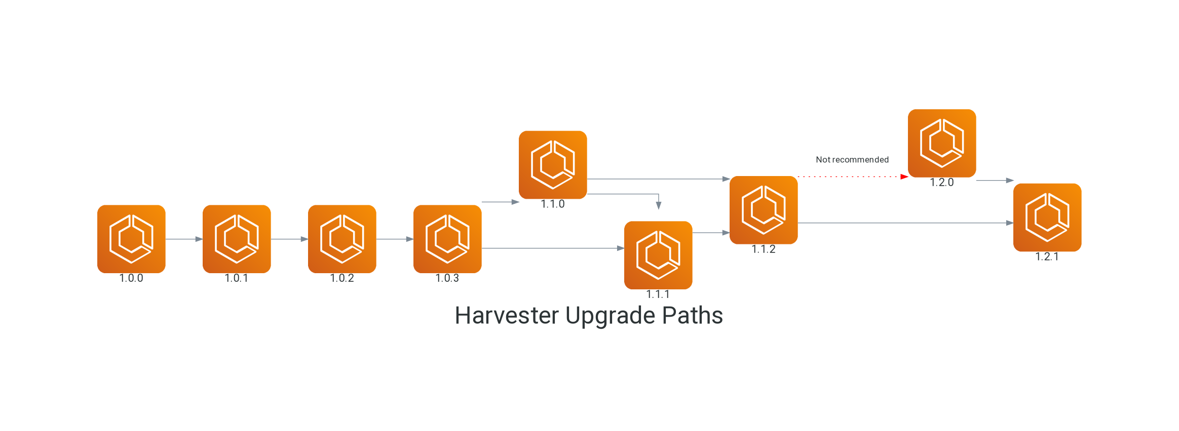
This option provides for creating diagrams in Python code. It has a comprehensive icon library for modern architecture components built-in. In this diagram I've used an AWS worker icon to represent a release version of Harvester.
So, definitely in the diagrams-as-code camp. It's nice but perhaps too steep a learning curve for a documentarian, just needing to produce a diagram. Great for Python programmers though. It felt easy to get going and then difficult to specify some details like label placement. But, as it's Python it should be possible if time is invested. Seems to be based on Graphviz underneath.
This code:
Python diagram code - harvester-upgrade-paths.py
from diagrams import Diagram, Edge
from diagrams.aws.compute import ECS

with Diagram("Harvester Upgrade Paths", show=False, outformat="png"):
    rel_1_0_0 = ECS("1.0.0")
    rel_1_0_1 = ECS("1.0.1")
    rel_1_0_2 = ECS("1.0.2")
    rel_1_0_3 = ECS("1.0.3")
    rel_1_1_0 = ECS("1.1.0")
    rel_1_1_1 = ECS("1.1.1")
    rel_1_1_2 = ECS("1.1.2")
    rel_1_2_0 = ECS("1.2.0")
    rel_1_2_1 = ECS("1.2.1")

    rel_1_0_0 >> rel_1_0_1
    rel_1_0_1 >> rel_1_0_2
    rel_1_0_2 >> rel_1_0_3
    rel_1_0_3 >> rel_1_1_0
    rel_1_0_3 >> rel_1_1_1
    rel_1_1_0 >> rel_1_1_1
    rel_1_1_0 >> rel_1_1_2
    rel_1_1_1 >> rel_1_1_2
    rel_1_1_2 >> Edge(label="Not recommended",
                      color="red", style="dotted") >> rel_1_2_0
    rel_1_1_2 >> rel_1_2_1
    rel_1_2_0 >> rel_1_2_1
produces the output PNG when run python harvester-upg.py.

Observations
A good use of these tools in our documentation. The Mermaid version seems better integrated with Docusaurus and VScode. It's easier to write and preview directly in the markdown. The PlantUML is saved in a file and processed with a CLI to produce an PNG or SVG for integration into the document. I think the Mermaid version looks better. It appears clearer, diagrammatically.